Chart Wizard - Series Manager
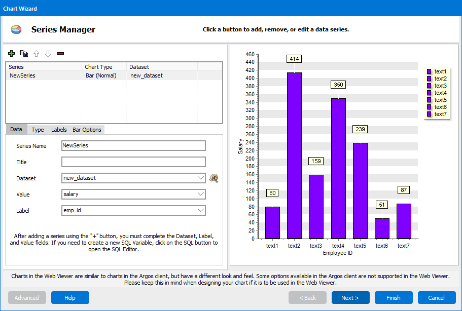
The Series Manager screen enables you to create and manage multiple series for a chart. A series is a set of values or items that are grouped together for the purpose of charting them in a logical and meaningful way. For example:
- SALES - sales figures for a given time period.
- GROSS SALARY - salary amounts for a group of employees.
- RECEIVABLES - accounts receivable totals by customer.
A pie chart or a gauge chart uses just one series, whereas a bar or line chart might have several series.
Manage Series
The Series Manager has the following toolbar options. (Note that the icons look slightly different depending on whether you are creating a classic chart or a standard chart.)
| Classic Icon | Standard Icon | Function | Description |
|---|---|---|---|
|
|
|
Create New Series | The Add button, or plus sign, allows you to add another series to the chart. Clicking on it adds a new series with a default name. The first series you create will be a bar chart by default. For each additional series you create, the new series will inherit the chart type of the currently-selected series. |
|
|
|
Copy | Duplicates the currently-selected series. |
|
|
|
Move Up or Down | Allows you to change the order of the series. Series are displayed on the chart in the same order they are listed in the Series Manager. |
|
|
|
Delete Series | Deletes the selected series from the chart. |
Underneath the list of series, you have several tabs that may be available to you, depending on the type of chart. These tabs will become active once you have created and selected a series to modify.
Series Data
The Data tab is where you configure the data used for the series. You must complete all fields except for Title in order to proceed.
- Series Name - A descriptive name for the series.
- Title - The name of this series as it appears in the legend (if shown) when there is more than one series.
- Dataset - The data that is used to construct the series. You can select an existing dataset from the list, or select "Create a new dataset" in the list and then click the
 /
/  button to create a new dataset. You can also select an existing dataset and click
  /
/  to modify that dataset. Opting to create a new dataset or edit an existing one will open the SQL Editor.
 - Value - The field that should be used as the numerical data for your chart (for example, sales, salary, account balance, etc.).
- Label - The field that describes what is being graphed (for example, years, departments, account types, etc.).

Series Type
Choose the type and sub-type of chart you would like to create. The default is a bar chart. Refer to the page for each specific chart type for details of the available options.
- Bar Charts
- Pie Charts
- Gauge
- Line Charts
- Points Charts (scatter plot)
- Area Charts
Series Labels
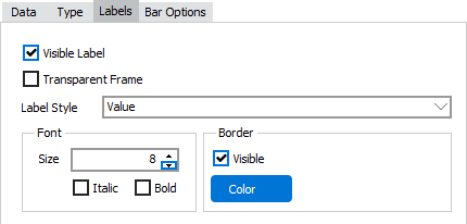
The Labels tab is where you specify how the labels drawn near each data point on the chart appear. Labels are available for all chart types except Gauge.

![]()
Standard charts have two options for the labels:
- Visible Label- When checked, the labels are permanently visible on the chart, instead of only displaying when hovering over a data point.
- Label Style- Choose whether you want to display the value or the percentage. Standard charts also have an option to format the labels as currency.
Classic charts have additional label options:
- Transparent Frame- Check to hide the shaded box surrounding the label on classic charts.
- Font - Change the font size, and apply bold or italic formatting.
- Border - Control the visibility and color of the border around the label box. This has no effect when the label frame is transparent.
Chart Options
The Options tab for classic charts provides these options:
- Chart direction (vertical or horizontal)
- Bar or point colors
- Other options specific to the chart type
The Bar Options tab for standard charts provides these options:
- Direction of the bars (vertical or horizontal)
- Color for each series
The Axis Options tab for standard charts provides these options:
- Scaling (you can automatically scale the chart based on the data, or specify a minimum or maximum value)
- Currency display controls (symbol, etc.) for axis labels
Button Navigation
- Although the Advanced button appears on this screen when creating a classic chart, it is not enabled until you get to the final Chart Wizard screen, Configure Legend and Titles. Note: Standard charts do not have an Advanced option.
- The Help button opens the help page for this screen.
- The Next button takes you to the Configure Theme and Panel screen.
- The Finish button exits the wizard and builds your chart. It is available once you have created at least one complete series. In order to be complete, a series must have a name, a dataset selected, and values chosen for label and value. All of these fields are on the main Series Manager screen and Data tab.
- The Cancel button cancels the changes you have made and exits the Chart Wizard.